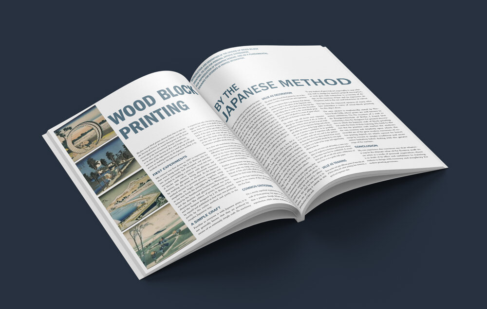
WOODBLOCK ARTICLE LAYOUT
For this project, the challenge was to create two versions of a modern editorial design using a two-page layout and fonts of our choosing.
Because the original article was written at the turn of the 20th century, it had a reserved, scholarly tone and lacked any imagery. I researched the article topic and chose a variety of images that complemented the material and would provide visual interest.
I chose font pairs that not only worked well together but were also familiar to modern readers of similar articles in order to make the material more readable. I also used multiple font weights to create subheadings that helped break up the density of the text into accessible blocks.
As the topic of the article dealt with a culturally significant art form, I endeavored to match this with a respectful and appealing design that still supported the original tone of the article.


